Repo4 min read
Glass edge: bending the page like a lens
The glassy band at the top of this site, explained without too much code. What it does, which settings make it look like glass, and what went wrong along the way.
- SVG filters
- backdrop-filter
- Canvas 2D
- Vibe coding
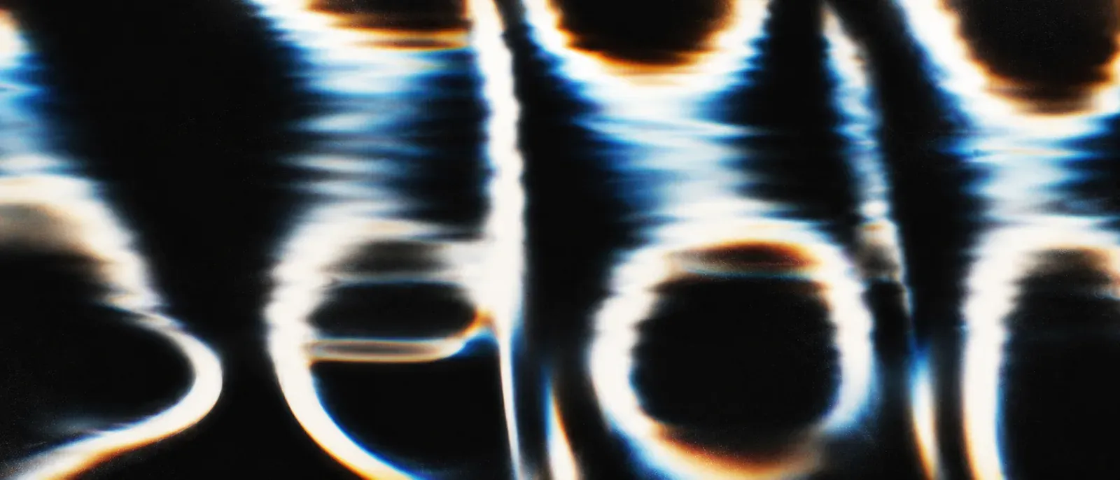
Scroll any page on this site and look at the top of the window. The content stretches upwards, spreads out a little at the sides and picks up a soft rainbow edge. As if the page were sliding under a glass rod.
The idea comes from a site that does this with WebGL, a full 3D engine. Here it’s much lighter: a bit of CSS and one SVG filter. Building it was the easy part. Making it look like glass, and not like a broken screen, took a lot of small adjustments.
What actually happens
A thin, invisible strip sits at the top of the window. Everything that scrolls underneath gets bent by it.
How much each part bends comes from a few greyscale images, drawn once when the page loads. Mid-grey means “leave it where it is”, lighter and darker push it in one direction or the other. One image handles the vertical stretch, one the spread at the sides, and a few more passes add the colour edge.
It works in Chrome, Edge and other Chromium browsers. Safari and Firefox get a simple frosted blur.
Six settings that make it feel like glass
Height of the band
Around 100 pixels feels right. Lower and it’s just a flicker at the edge. Higher and it starts to swallow the text you’re trying to read. The bottom of the band fades out softly, so there’s no visible line.
The lens
Real glass bends the most at the edge and less towards the middle. The stretch here does the same: strong at the very top, then quickly calmer, until it meets the page without a seam.
Two things break the illusion instantly. If the curve ever turns back, the content flips upside down. And if it doesn’t end at exactly the page’s own speed, you see a hard edge where the glass stops.
Spread at the sides
Content drifts outwards at the left and right, not at all in the centre. About 2.5 % of the window width works best. Less and nobody notices. More and the sides look broken, not curved.
Smooth instead of stepped
This was the trickiest part. The greyscale images only have 256 shades, so a big movement turns into visible little jumps, like a staircase. Two things fixed it: giving each direction its own image with just the range it needs, and a touch of blur and fine noise to hide what’s left. Too much blur and the glass goes muddy, so less is more here.
The rainbow edge
The stretch runs five times, each a little stronger and tinted red, yellow, green, cyan and blue. Where they overlap, the colours add up to white again, so only the edges show a faint rainbow. Keep it subtle. Past a certain point it stops looking like light and starts looking like a fault.
The mirror at the top (optional)
A real glass rod shows the content upside down right at its edge before it folds back. That’s here too, as a small zone at the very top. It’s a detail most people won’t consciously see, but it makes the glass feel more real.
The bug that only showed up on a second screen
On the laptop, everything looked right. Then the window moved over to an external monitor, and the whole band was suddenly crooked, leaning to the left.
Every screen shows colour a little differently, and the browser quietly adjusts for it. The first version stored its directions in colour, so each monitor bent the page in its own way. Plain grey looks the same everywhere, and switching to it fixed the problem.
Try it yourself
The whole thing is open source: glass-refraction on GitHub. One small JavaScript file, no dependencies, no build step. Drop it into a page and the glass edge sits on top of whatever scrolls underneath.
The repo comes with two demos. One is a long scroll page with a settings panel, so you can push every value until it breaks and copy the settings you like straight into your own code. The other is the glass rod from above, with all its sliders. The README explains the options and why the maps have to stay grey.
The real effect needs Chrome or Edge. Safari and Firefox get a frosted blur instead.
Quick reference
| Setting | Works well |
|---|---|
| Band height | 80 to 140 px |
| Spread at the sides | 1.5 to 3.5 % of the width |
| Rainbow edge | 2 to 6 % |
| Softness | light, less is more |
| Mirror zone | 15 to 30 % of the band |
Next entry
VoiceInk fork: Whisper API with a live preview